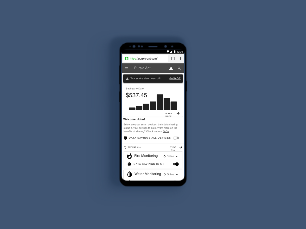
Purple Ant

Purple Ant
Designing the consumer-facing side of a responsive website
Client: Purple Ant
Role: UX Designer, UX Researcher
Tools: Sketch, Figma, InVision, Miro, Keynote
Duration: Four weeks
Overview
Home monitoring made simple.
Purple Ant is a subscription-based, home monitoring platform that uses agnostic software and smart home sensors to prevent property damage.
With their home monitoring platform and an incentive of discounted insurance premiums, Purple Ant aims to make homeowners more proactive (ex. spotting water leaks early before it turns into thousands of dollars of damage) by managing and connecting data from the homeowners' smart devices directly to their property insurers.
The Ask.
How can Purple Ant help homeowners be more proactive?
We were tasked to build out the consumer-facing side of the website to help homeowners (tech savvy, age 30-50) be more proactive with issues in their property by researching and designing three key features:

Notification alerts (e-mail or SMS) for sensor triggers

Consent to share data in return for policy discounts
Recommendations hub for home preparedness
The Challenge.
My motto is to question everything and after speaking with the CEO for clarification we realized two things:
Consent is a top priority: We needed users’ consent to share data for any other features or notifications to function. So researching the mental models behind data sharing and understanding what makes homeowners more likely to give consent became a top priority.

Do homeowners want a discount in return for sharing data about their home?:
Purple Ant’s CEO has been in the insurance industry for over 20 years, so you can definitely call him an expert. However for this particular demographic of homeowners, aged 30-50, there was no prior research that they wanted discounts in return for sharing their data. In this sense, the first phase of our research became more of an exploratory effort because we needed to figure out what users wanted in return for sharing their data.
With those challenges in mind, we realized that we needed to touch upon those themes when creating the user interview questions. We needed to understand:
Users’ mental models surrounding home insurance
Users’ knowledge and perceptions regarding data sharing
What users want in return for sharing their data, what do they perceive to be the value of their data?
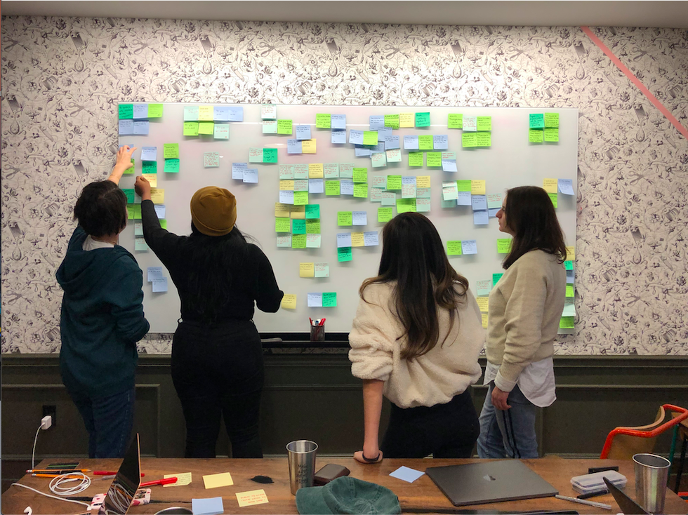
Our team analyzing user interviews through an affinity map
Key user interview insights

Alex, 41, owns a few smart devices like a Nest but doesn’t want to worry about his home, family privacy and security.
After 9 user interviews and 1 SME interview, we found:
Users generally distrust home insurance companies. But the more human and friendly the home insurance companies feel, the more comfortable homeowners may feel.
Not everyone wants money for their data: While some target users did want money in return for their data, we found that many other target users wanted something else, like convenience or security.
Data sharing policies are often dense and hard to understand: We found that users had a hard time understanding the data policies and terms and conditions that they often see
Our target users were not giving informed consent.
What really stood out from our user interviews was that when it came to giving informed consent, our users were experiencing information overload so they weren’t actually reading through the terms. And they weren’t feeling good about it.
“It’s a bit overwhelming and I always feel bad when I hit ‘Agree’ without actually reading through anything.”
Turn that frown upside down, Alex.
Did you feel overwhelmed just by watching that gif? Yes? That’s probably how our users feel when they typically need to give consent.
Not only were users like Alex giving consent without reading through the terms, they were also having negative reactions after doing so. We needed to change this whole process and create a design that helped Alex understand what he was consenting to so that he could feel good about hitting agree.
Helping Alex turn that frown upside down was our next goal. Thinking about it in this way, in terms of feelings of delight and moments of clarification, would help with our design solution.
Our users should give informed consent and feel good about it.
Redefining our target users’ problem
So when we redefined the problem, we realized that our target users needed a simple way to give informed consent so that they can understand how their data will be used (and feel good about it) in order to save money and conveniently monitor their homes.
Ideating and creating concepts about simple ways to help users give informed consent
I co-led my teammates through a few rounds of 6-8-5 sketching. We wanted to focus on the different ways we could give users control over the data and devices they share with Purple Ant while also getting something of value in return.
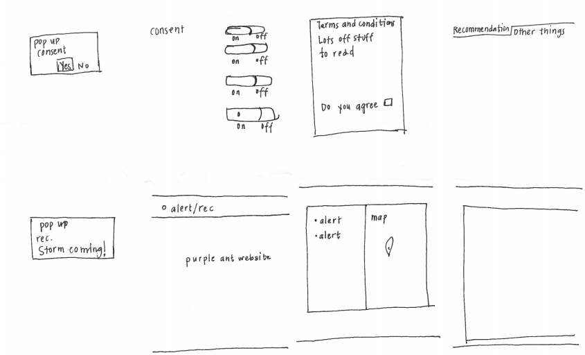
First round of 6-8-5 sketching concepts included a toggle switch for consenting to sharing data from smart devices individually
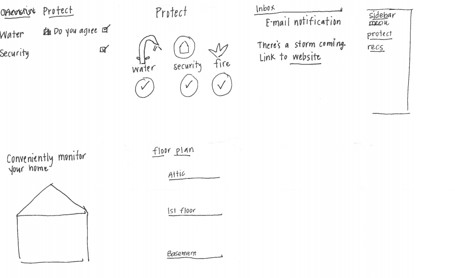
Second round of 6-8-5 sketching included an image of a house and “conveniently monitor your home” where users can have the option to monitor their home as a 3D rendition
Using a mobile-first approach and InVision, we agreed on 3 different concepts that touched upon managing consent and permission, the recommendations engine, and the savings page.
Concept Testing
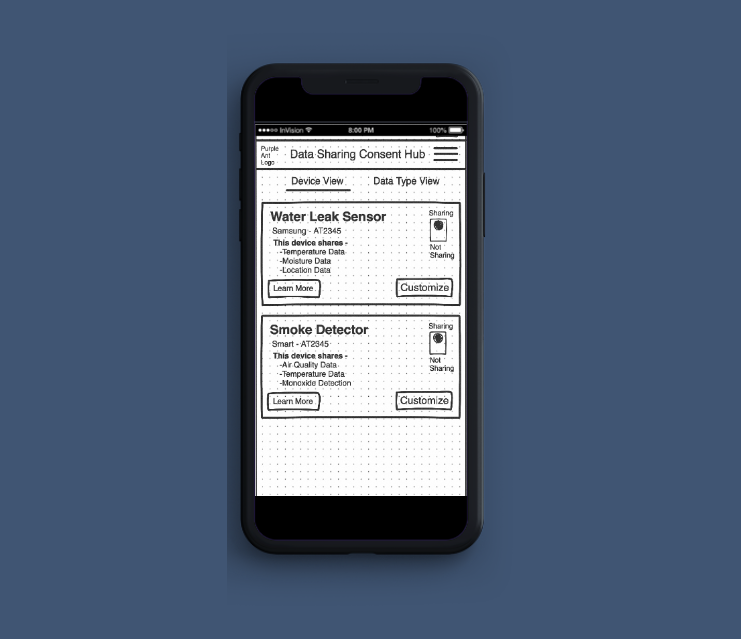
Concept 1
To establish trust and transparency, we created a consent management hub where users can toggle their sharing permissions by device or data type. They would also click “learn more” for a non-overwhelming description of how their data will be used.
Concept 2
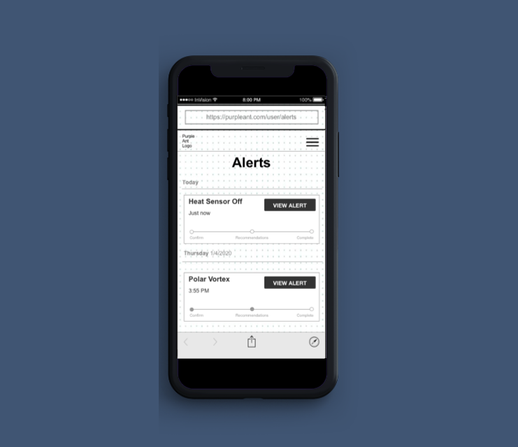
A recommendation engine alerting the user to upcoming threats and trips to the sensor system, which can also recommend services/items to help correct the situation
Concept 3
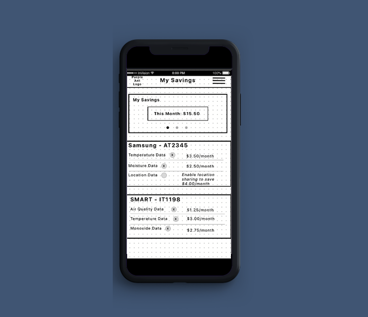
To further establish transparency and to target users who did want monetary discounts in return for sharing their data, we created a “savings” page where users can see the direct link between the data they choose to share and its correlation to the money they save.
Findings.

Users liked seeing their savings upfront
Users liked the transparency and transactional display of data (getting money in return for sharing). They also found the data sharing policy to be easy and simple to understand.
Users did not like seeing the vertical toggle switch
Users were confused about the horizontal toggle and thought it was redundant to toggle data through both the data savings page and the data consent hub.
Converging.
With Concept 1 as an example shown below, we used feedback from our concept tests to influence the next iteration of our mid-fidelity solution.
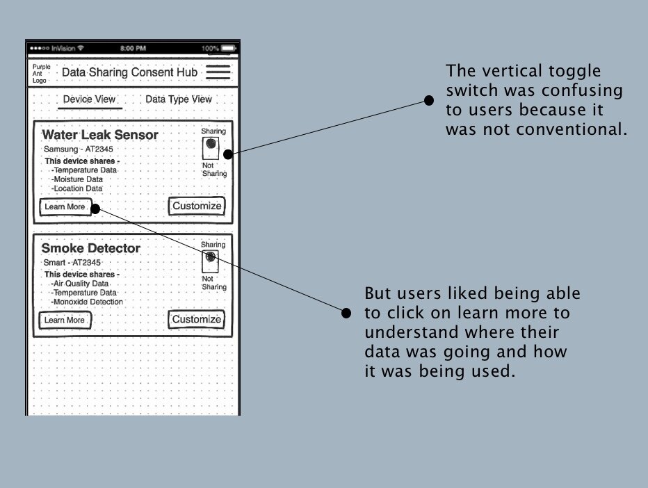
For the next iteration, we needed to focus on merging the “savings” and “consent” to make the user’s experience more seamless and convenient. We also needed to make sure that the purpose of each page was more apparent and use language that was more commonly associated with each function.
The solution.
Recommendations.
Results from our usability tests showed that we were heading in the right direction. Our users really appreciated the FAQs section that gave them a breakdown of what was happening with their data and how it was being used.
However at the point of giving consent on the main page, some users felt like they didn’t have enough information to give consent. Some users also felt that navigating all the alerts was too much effort and might not be worth the discount.
Next steps
Next steps include further testing on how best to display the option to give consent so that users feel like they are informed enough but not in an overwhelming way, to give consent. Our client was pleased with our research and designs and it gave him the building blocks on how to continue building out the consumer-facing side of his web-app. However, additional testing is necessary to see if this platform is something that users want.